Pencil Booklet - Noun Exploration
The goal for this booklet was to explore and understand digital printing processes with imagery manipulation and to prepare digital design for reproduction. I altered the images based on the limited selection of two solid coated Pantone colors (419U and 123U). This helped to understand color management and develop a better sense of color separations. The booklet measures to be 5 x 7 inches closed, 10 x 7 inches with the cover laid out flat, and the infold measures out to be 15 x 7 inches. The programs I used during the making of this booklet were Adobe Illustrator, Adobe Photoshop, and Adobe InDesign. Click here to see my Dropmark collection containing the original images that encouraged this project.
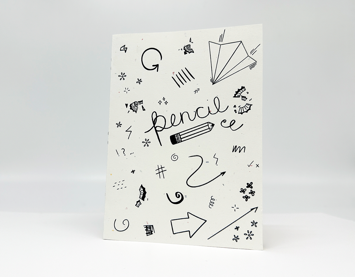
Hero Shot of my completed booklet. My choice of paper for the font cover is a beige card stock with colored speckles.

Mind map of the word Pencil. Made as a way to explore all the different directions the word can go in.

Layout of both the front cover (on the right) and the back cover (on the left). Both sides were created as my own drawings, made into vector images, and deliberatly placed. The front cover was made to encapsulate the spirit of the basic pencil. The back cover was designed to show the description words for the noun as seen on each page inside the booklet.


Exploration of Solid Coated Pantone colors 419U (middle) and 123U (right).

Digital image of spread. Pages 10 and 11.

Digital image of spread. Pages 14 and 15.
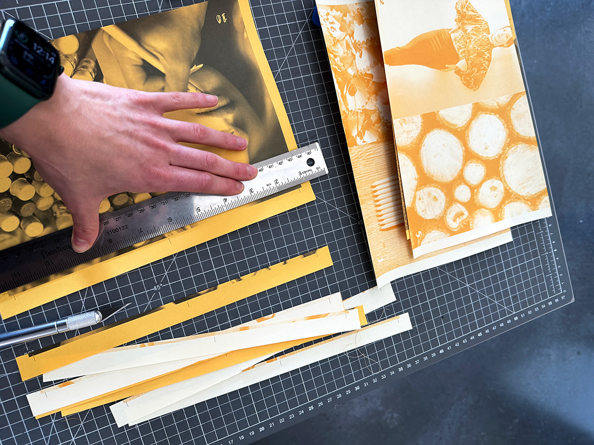
In the process of putting the book together, I used an x-acto knife, ruler, and cutting mat for clean cut edges on all the pages.

The infold, in the right crease of which you can see the staples used to bind the book together.
Video showing each completed page and entirety of booklet.

